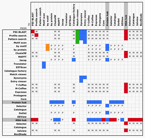
The full connectivity of the web site is impossible to show in a single figure. Thus we propose the following table that allows to understand better the enormous gain of connections we benefit from the hubs.
Interconnectivity between different services within the MyHits web site is represented using colored squares when it is possible to send data directly FROM a page TO another one.
Most services appear to be linked with one of the two hubs either in input or output. The colors scheme is related to the type of the data being transferred (see below).
